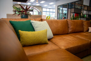
 As with many interior design projects, color was a central focus for us throughout our remodel of the showroom. Everything from partitions to pillows, workstations to walls, storage to seating was considered for how color would play and blend throughout our space. Because we are working showroom, we considered not only colors that we wanted to work around on a daily basis, but also colors that our clients and partners would want to see in-person before applying them into their own spaces.
Selecting colors for a workspace, especially for furniture, feels like a pivotal decision that can make or break the aesthetic of the space. This pressure has led to the rise of a number of color-related myths that seem to drive or at least influence decision making in commercial furniture projects. Through debunking some of these myths, we infused color throughout our space in a way that boosted our brand and accented our culture.
Myths of Using Color in Office Furniture Design
Myth #1: Neutral Colors are Professional, Safe, and Timeless
For anyone who has visited our showroom before, you know that neutral colors are incorporated throughout space, especially in our main block of workstations. This set of workstations, which in our remodel shifted over to the opposite side of our showroom (more to come on how we did this!), are made of mostly white panels. While we love these and show them off to everyone who comes into our space, we wanted to add in more colors throughout our space to illustrate that neutral shouldn’t always be the go-to option.
While we love our old block of workstations, we want customers and partners to know that neutrals don’t always have to be the answer!
Because interior design for commercial furniture has pushed neutral colors in workstations so heavily in recent years, many workspaces are starting to blend together and lose some of their uniqueness. In the name of creating a clean, timeless look, neutral colors used too extensively can also sometimes leave a space looking drab and like every other competing space.
In order to showcase an alternative to this neutral color reliance that still looks professional, we created a new block of workstations to confront our next myth.
Man needs color to live.
– Fernand Léger, modernist painter
Myth #2: Colorful Furniture is Gaudy, Risky, and Will Go Out of Style Quickly
We believe that a professional look doesn’t have to mean neutral or stark. From our point of view, thoughtful design that weaves its way through an entire workspace will always look professional, and infusing color tastefully will only add more visual interest for employees and visitors. We are seeing more and more from our partners and customers that people are starting to opt for more colorful, statement pieces in their commercial furniture.
To highlight this trend, we designed two new blocks of workstations in our showroom, built around Haworth Compose Beams and Compose Connections panel system, that feature beautifully tasteful color schemes.
With these workstations, we used neutrals as accents, rather than central. This switch allowed for the colors to carry the power of the design and be featured in a way that creates contrast from the typical white workstations.
A small detail that we love: a pop of color in an unexpected place. Inside of the Belong Storage Pantry, we hid a little Chartreuse for a fun surprise.
Myth #3: Color Has No Effect on Employee Well-Being, Attraction, or Retention
While we would thoroughly enjoy diving into color theory, the topic is a bit too extensive to cover in this small section. In short: “colors have a very real and tangible effect on how people act, react and even feel.” It has been scientifically proven that certain colors are associated with both positive and negative effects in humans. As noted in Commercial Design magazine, “Certain colors can help to improve our productivity and well-being, whilst others work against us, severing focus and interrupting our general flow.”
In addition to affecting current employees, color should also be a consideration in attracting new employees. Something that businesses and organizations often forget is that recent graduates have spent their whole lives in education settings, where pops of color are everywhere. Universities especially have become masterful at weaving their brand and culture with color throughout their spaces. There is a bit of irony that we hire graduating students and place them into offices dominated by neutral and bland color palettes after they have been so inundated with colorful spaces for so long.
Ironically, we hire graduating university students who are comfortable with color everywhere and put them in bland offices.
On this subject, Interior Design Magazine notes, “New graduates are not coming from a place where they’ve had to sit in one place all day, and they won’t be inspired if every place looks the same. They’re used to a campus full of interactive, tech-enabled spaces to choose from and will demand the same at work.”
Myth #4: Adding Color to a Space is Expensive and Permanent
We know that buying commercial furniture is an investment and adding or updating workstations or lounge pieces that ooze color is not always something that fits in that year’s budget. If you aren’t ready to remodel like we were, there are still ways to add color pops throughout your office in less expensive and more flexible ways.
Here are a few inexpensive, quick ways to add color pops to your workspace:

Pillows

Paint

Wallpaper

Rugs
Myth #5: Color Palettes Must Match Your Brand Exactly
Feeling inspired to add color to their space, certain organizations fall into the trap of limiting color pops to their brand colors and only those exact brand colors. They get caught up in spending considerable time and energy finding upholstery and hard surface samples that match the blue in their logo.
Our Interior Design Manager, Jill Sulgrove, says, “While using exact brand colors on promotional materials like brochures and apparel is important, you do not have to use those specific colors as a stripe in your carpet, a tile on your panel system, or your wall color. In workspace design, it’s often more visually appealing to play with versions of branding colors that are more subtle and inviting rather than using literal RGB numbers. It creates a layered, more interesting visual that still looks and feels like your brand. So don’t feel pressured to paint a wall a loud, obnoxious lime green. It may work well in your logo but doesn’t have the same effect in your interior workspace.”
For our space, we added colors that truly embody our organization’s character. While our branding colors are Crimson, Malibu, and Mako, we used a completely alternative color palette throughout our remodel that complemented our brand without clashing with it.

Our brand colors.

A new color palette in our remodeled showroom.
Wherever you are on the comfort scale with color, we think it’s worth thoughtful consideration for every organization’s workspace. We hope that the colors we used throughout our space help to demystify some of the myths about color in interior design and inspire you to be more bold with color when you are building or remodeling the next space for your company. If you need help with color selection, we would love to partner with you to create something inspiring.
Need Help with Color Pops?
We would love to help your team think through how to incorporate color throughout your office. Contact us today if you want to start a conversation!
Error: Contact form not found.


